Nay Zaw Aung Win

Mechanical Engineer by degree,
Data Scientist by passion!
View My LinkedIn Profile
Visualizing COVID-19 In Different US States
Project Description: The goal of this project is to visualize the impact of COVID-19 on different US states (and territories) and their corresponding responses. The data for this project comes from Google’s COVID-19 Open Data.
The interactive dashboard has been shared to Tableau Public and can be accessed here.
The python code used for data preprocessing, the SnowSQL (CLI) commands for staging+loading data into Snowflake and custom SQL queries used in building the Tableau dashboard can all be found in in my Github repo.
1. Project Motivation: I traveled from NY to NC in mid-2021 and noticed that most people in NC were no longer wearing masks.
In June 2021, I traveled down to Winston-Salem, NC from Troy, NY for a summer internship. Most people who were walking around in the streets of Troy were still wearing masks at the time. I even recalled a few times when I would forget to put a mask on before getting into an Uber in Troy and the Uber driver would remind me to put one on before I get in. However, when I landed in PTI airport in Greensboro, NC (Greensboro was the slightly larger city next to Winston-Salem and has an airport) and got inside an Uber, I started noticing the differences between the two states, in terms of the regulations and peoples’ attitude toward them. I was wearing a mask but the Uber driver wasn’t. He told me that he wouldn’t mind if I didn’t either. He asked me where I travelled in from and when I told him “New York”, his response was “Oh, so you guys are still wearing masks up there, huh? North Carolina just lifted its mask regulation last week”. When I finally arrived at my apartment in downtown Winston-Salem, I decided to go down and check out the cafe across the street. There wasn’t a single person inside the cafe, who was wearing a mask. Neither was anyone in the street outside.
So, does a state/territory with stricter COVID-19 regulations handle the impact of COVID-19 better than a state/territory with more relaxed regulations?
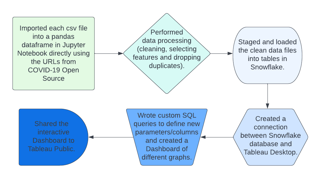
2. Project Workflow Chart
3. Plots Created
-
The first plot created is an area graph with five measures on the vertical axis: (Fully) Vaccinated, Tested, Confirmed, Hospitalized and Deceased. On the horizontal axis, we have date. The values of the measures are monthly averaged figures for all of US.
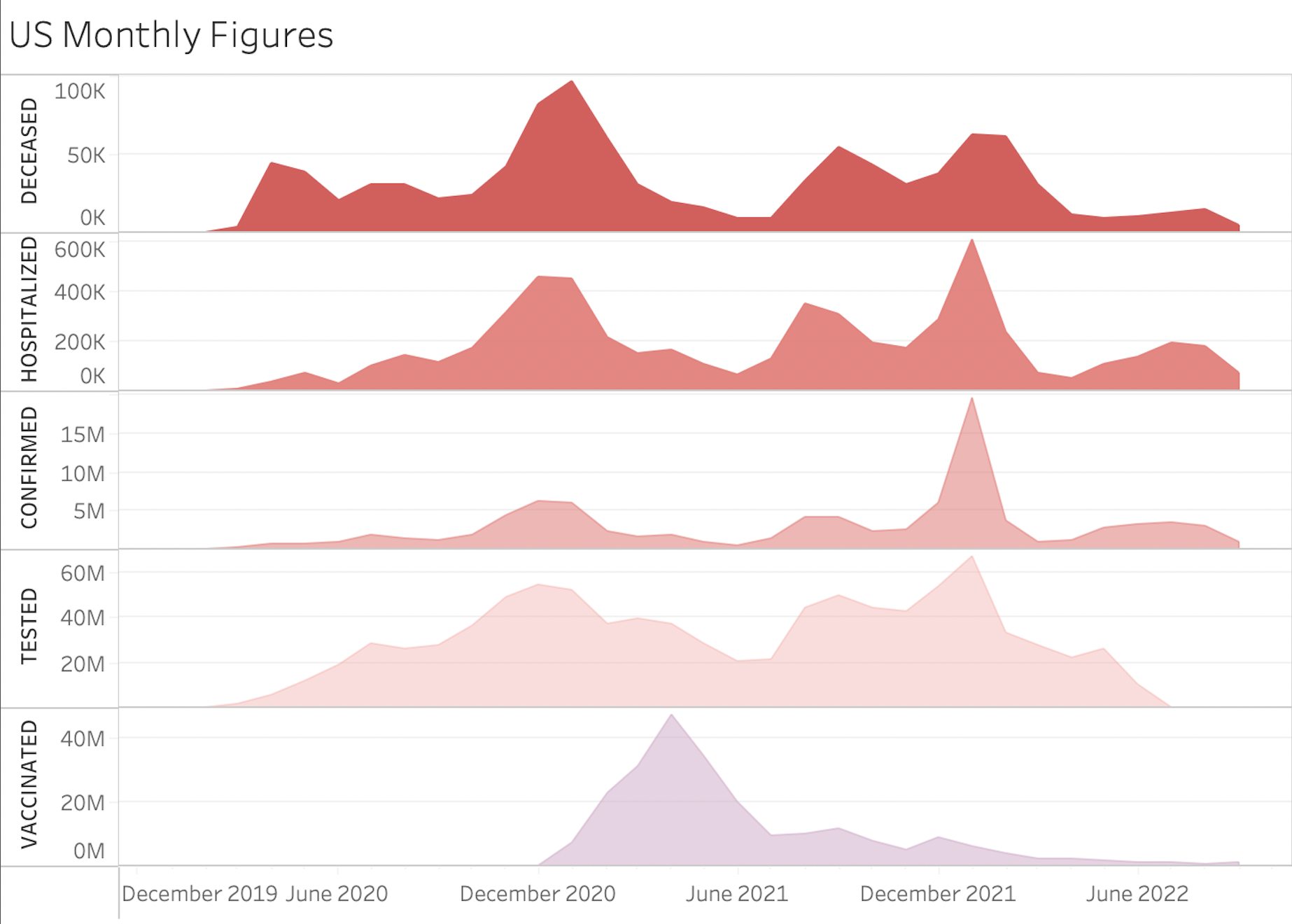 There are two things that stand out in this graph. First is that the number of fully-vaccinated people started to grow at the start of 2021 and peaked around April 2021. This coincided with the decline in value (negative slope on the graph) of the other four measures: Tested, Confirmed, Hospitalized and Deceased.
The second thing that stands out in this graph is there was a sudden increase in value that the top four measures (Tested, Confirmed, Hospitalized and Deceased) around the beginning of the year 2022. One explanation for this could be the new wave of COVID-19 in the form of the Omnicron variant, which was found to be highly transmissible.
There are two things that stand out in this graph. First is that the number of fully-vaccinated people started to grow at the start of 2021 and peaked around April 2021. This coincided with the decline in value (negative slope on the graph) of the other four measures: Tested, Confirmed, Hospitalized and Deceased.
The second thing that stands out in this graph is there was a sudden increase in value that the top four measures (Tested, Confirmed, Hospitalized and Deceased) around the beginning of the year 2022. One explanation for this could be the new wave of COVID-19 in the form of the Omnicron variant, which was found to be highly transmissible. -
The second plot created is a map graph that shows the aggregates of the same five measures from above for each state (the values of the five measures are only visible when you hover over the interactive graph). The color of a state depends of the number of ‘Deceased’ in it. The higher the number of deaths in a state, the darker the color is on the graph.
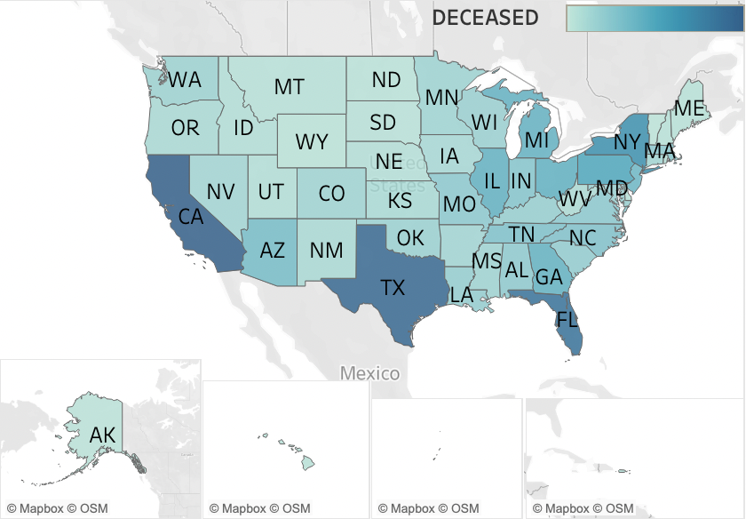 We can see that California, Texas and Florida are the states with the highest numbers of deaths from COVID.
 -
The third plot created is the line graph representing the Case Fatality Rate (CFR) of different states, aggregated at the monthly level, since the beginning of the COVID-19 pandemic. CFR is defined as the number of deaths from COVID divided by the number of diagnosed COVID cases. CFR may not be the ideal metric of measure for how well a state is performing in handling the impact of COVID-19. One of the main reasons is because it’s impossible to know the true number of diagnosed cases. So, we have to rely on the number of CONFIRMED cases, which is likely much less than the true number of cases. Read more about CFR in this article.
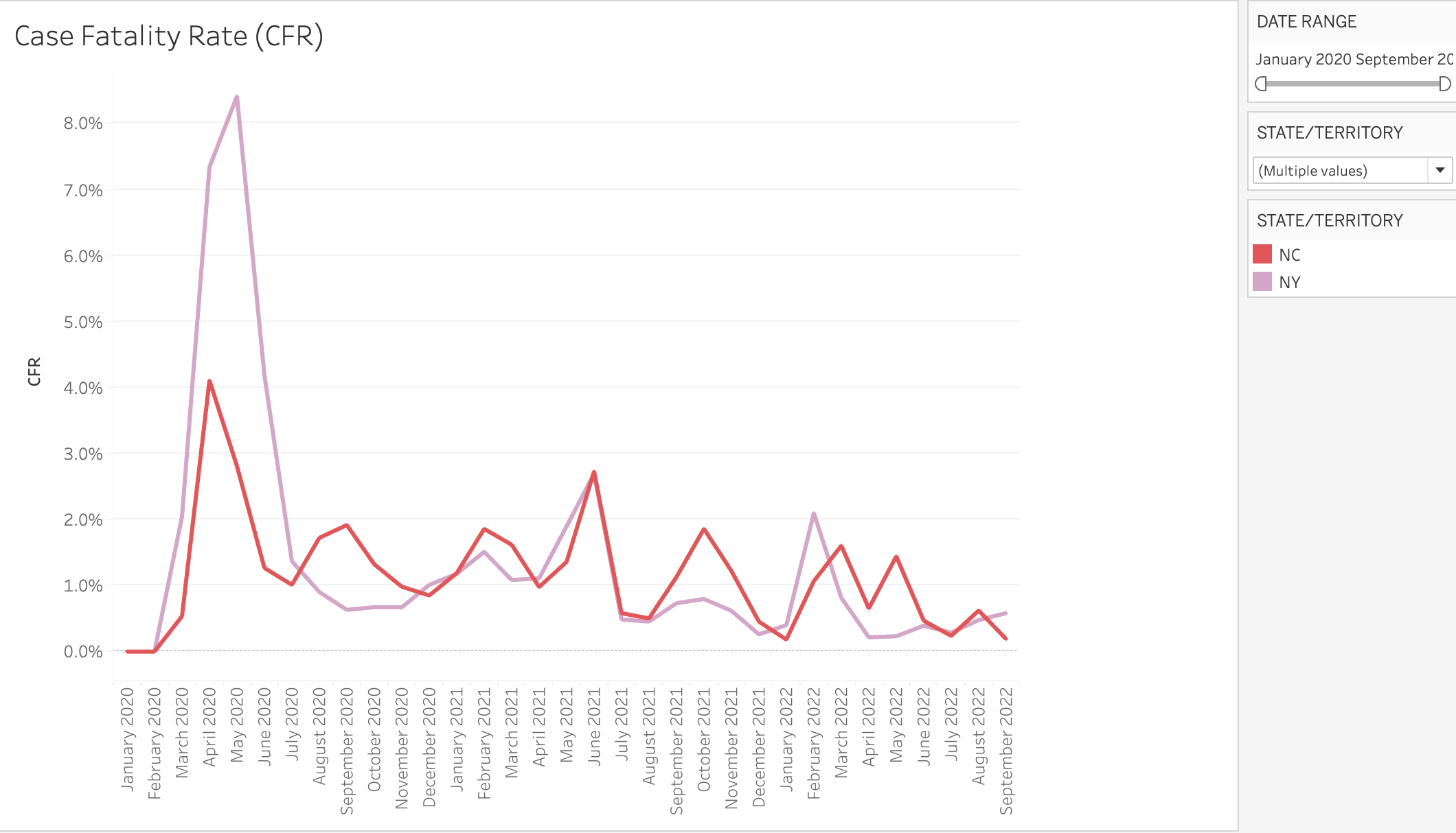 The plot compares CFR in New York and North Carolina (although you can use the filter on the right to add/remove any number of states/territories to the plot) since January 2020. We see that for the first half of 2020, CFR was much higher for NY and it was for NC. In the second half of 2020, however, the story was different. CFR in NY went as low was 0.6% whereas it went as high as 1.9% for NC. For the first half of 2021, the two line graphs had similar trajectories. However, between July 2021 and September 2022, four “spikes” in CFR were observed for NC where there was only one in that period for NY.
 -
The final plot created is the line graph representing the Stringency Index score of different states over time, aggregated at the monthly level as well. The Stringency Index score is calculated on the basis of the following 13 metrics: school closures, work closures, cancellation of public events, restrictions on public gatherings, public transport closures, stay-at-home orders, public info campaigns, restrictions on internal movements, international travel restrictions, COVID-testing policy, contact tracing, mask mandate and vaccination policy. A Stringency Index score takes a value between 0 and 100, where 100 is the strictest. Read more about Stringency Index in this article.
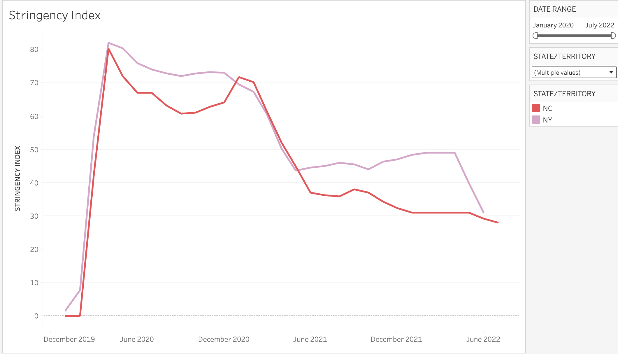 This final plot shows the stringency index scores of New York and North Carolina (again try out the interative dashboard to see the stringency index scores of other states). The plot shows the disparity in the stringency index scores between the two states during June-December 2020 and June 2021-September 2022, where the stringency index score of NY was significantly higher than that of NC. Interestingly, relating this back to CFR plot above, we see that these were the same periods where CFR was lower (or at least more mitigated) for NY than it was for NC.
Check out the the interactive dashboard to compare other states/territories.